Architectural abstracts are among the most successful in Hennie Schaper's photography.
In his own words: "Architectural abstracts are usually based on line play. As always, there are a few things one should keep in mind when approaching this subject. First, to create abstract images from architectural structures, modern buildings and bridges tend to be far more suitable than older ones, but as always there are exceptions to this rule. Second, perspective is a key parameter and can create an abstract feeling where one would not expect it in the first place - it is worthwhile to play around with an unusual point of view, and/or rotations in post-processing. Third, in terms of composition, the diagonal will often play a paramount role. Fourth, where lines and shapes are dominant, conversion to black and white should always be considered (even if it is not by definition the best choice) - and keep in mind that good black and white photographs usually have a high degree of contrast."
Here are a number of examples, with his own descriptions (click on the images to see them in his Flickr site).
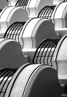
This is a nice example how a simple photograph (in this case of balconies in Paris) can become an instant abstract, simply by turning it 90 degrees. The different repeating patterns make the shot, and the black and white conversion is practically mandatory for an image like this.
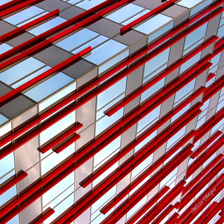
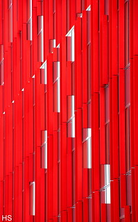
A relatively straightforward abstract shot, which comes to life due to the original building's properties - in this case the red decorations. This is the edge view of one of the latest additions to the Almere skyline (more of the tower can be seen here). The diagonal composition is as always a big plus in shots like this.
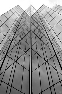
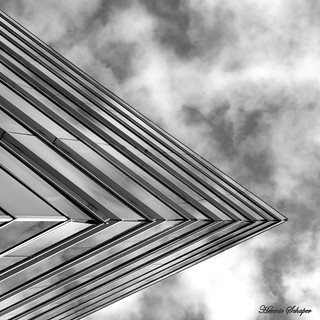
The most straightforward of the selected samples, but there are some subtleties at work here as well. This is the Houston Hilton hotel, reduced to strong line play. What makes the image remarkable is the stark symmetry, which is unexpectedly broken at the top right corner. That the lines are not perfectly straight, due to the slight distortion caused by the reflections, add a dash of spice as well.
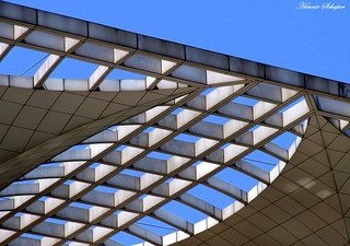
One of my own favourites. This is the detail of the roof of a building on the People's Square (the Shanghai Municipal Display Hall). I love the combination of lines and curves - as well as the optical illusion effects they cause. Black and white is the usual choice for these shots, but here the blue really adds to the overall feeling.
The subject in this shot is a peculiarly shaped apartment building in Almere (depicted larger here), which I cropped, rotated and converted to black and white. The texture in the sky is a nice plus, and breaks the illusion that there is a reflection involved in this shot.
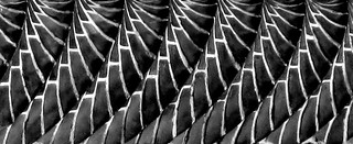
An exception to the rule of focusing on modern buildings: this is a detail shot of a building that is about seven centuries old. I think even those born in our home town of Kampen might have trouble identifying this - even though it is on the most photographed building. It is actually the decorated chimney of the old city hall, rotated 90 degrees and converted to black and white.
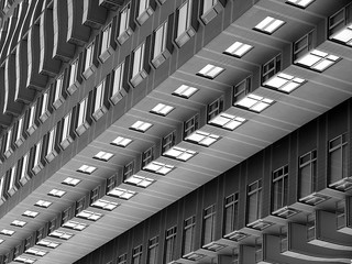
I think this is a different side of the same building depicted in the second example. Perhaps less dramatic, the subtle diagonal lines, both present (the thin white ones) and implied (the connection of the white decoration panels) make for a satisfactory abstraction.
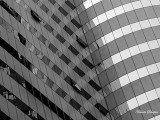
Another Shanghai shot - that city is an amazing source of inspiration for these types of shots. Taken at the interface of a straight and a curved part of the building, the result is a fascinating mixture of straight and curved lines. The perfection of the right hand-side is complemented by the more chaotic left-hand side, where the few open windows add to the overall effect.
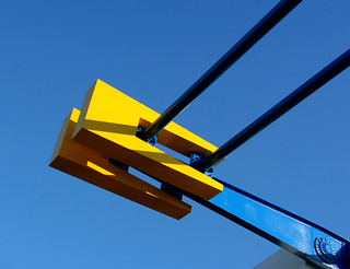
Most of my abstracts of this type are based on buildings, here we have one of a bridge. This is a detail of the top of an Amsterdam bridge I drove over every day near the office where I worked. Pure lines, complemented by the contrasting yellow and blue colour scheme.
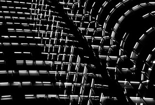
This is probably the same building as in the 9th example, but with a totally different effect. At night, none of the building's contours are visible, but the line play by the lit office lights is amazing. The few lights that were not switched on form interesting breaks in the overall line play.
It still amazes me how something as simple as a 90 degrees rotation of a straightforward shot of a high-rise building can have such an alienating effect. An Escheresque feeling, enhanced by the black and white conversion.
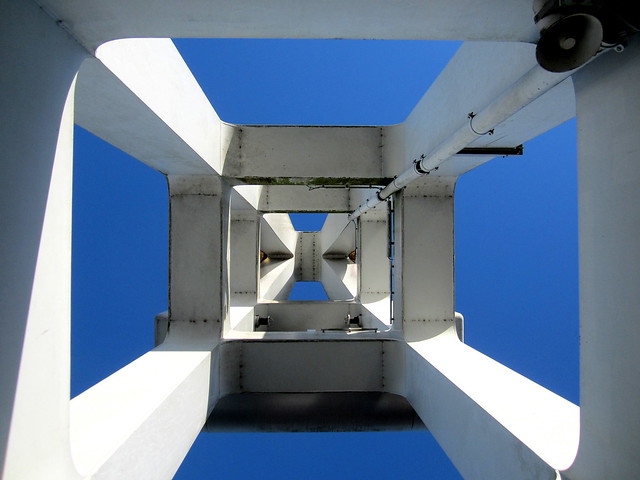
Another bridge, another abstract. This is the city bridge of Kampen (crossing the IJssel), with one of the pillars depicted from the bottom up.
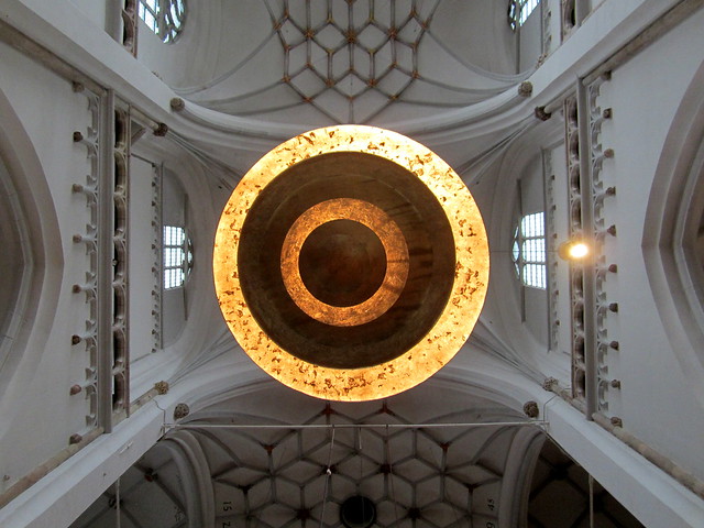
Most architectural abstracts will be found on the exterior of buildings, but there are exceptions. Here we see the inside of a church in Arnhem, where a ceiling shot gives an abstract feeling due to the line play.
Another inside abstraction. I encountered this on a stairway of the Zwolle museum, a perfect example of line play, enhanced by the light effects.


![Museum abstraction [2016 147/366]](https://c1.staticflickr.com/8/7576/27290659465_d2b6cd1ed3_z.jpg)